JAMES EADIE
Reviving a Victorian whisky brand and one of the world’s first trademarks
James Eadie was a brewer and distiller who was well known in Victorian times. He founded a brewery under his own name in Burton-on-Trent in 1854, where he also bottled a Scotch whisky blend based on a family recipe. This was then distributed among the 300 pubs he came to own. Eadie’s great-great-grandson Rupert Patrick – a former director at Diageo – wanted to revive the 160-year-old brand after discovering his ancestor’s company records. We were asked to help bring James Eadie back to life.
Our output included…
Brand strategy
Visual identity
Packaging
Marketing material
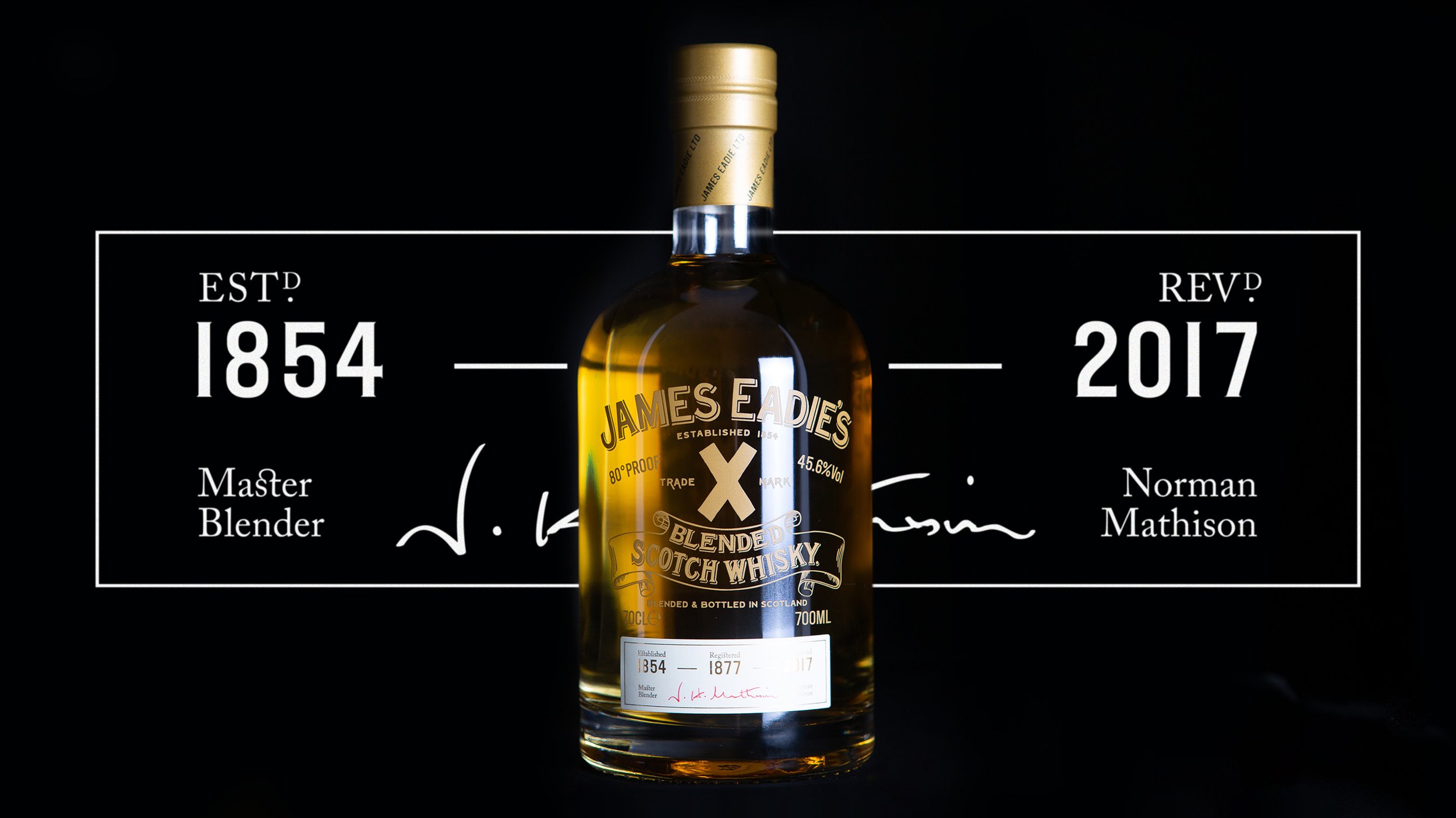
We wanted to take James Eadie, as it once was, into the future. Playing on the history of the brand was an important part of the process. Much like the whisky itself was carefully recreated, we wanted to refresh the simple, bold ‘X’ logo, which Eadie registered in 1877, making it one of the world’s first trademarks. We created a visual identity and messaging system that used the ‘X’ as shorthand for the brand’s heritage.
For all aspects of the relaunch, research was essential to creating continuity between the original brand and the revived one. This was true of both the product and the identity. Using one of the last surviving bottles from the 1930s and Eadie’s detailed ledgers, master blender Norman Mathieson recreated Trade Mark ‘X’. We reinterpreted the original bottle and packaging so that it feels relevant for today and tells the James Eadie story.
As well as retaining the brand’s ‘X’ trademark, we took inspiration from the visual language of the old bottles of James Eadie’s original blend and updated it. We screen-printed the logo, logotype and label directly onto the front of the bottle and created a clear label for the back for a more modern feel.
On the outer packaging, archive materials like photography from the Cross Street Brewery and handwriting from James Eadie’s ledgers are arranged into Xs on two sides of the box.


