THE CHAPTERS
Engaging a generation
Anchor Hanover is the UK’s largest not-for-profit provider of care and housing for older people, with over 50 years of experience in the space, and services in almost 1,700 locations across England. After the success of their first independent living retirement home, they decided to build new developments across the country, and asked us to create an identity and social media plan for one opening in 2021 called The Chapters.
Our output included…
Audience research
Brand strategy
Brand identity
Copywriting
Editorial design
Print
Media planning
Illustration
Social media
Paid advertising
The target audience for independent living retirement homes is niche—for those over 55 who have no care needs, are autonomous, and have the means or equity to buy their own homes. This lead us to begin the project with a heavy focus on research, so that we could fully comprehend why residents would want to move to these developments, what reservations they may have, and the impacts on their lifestyles. In addition to constructing and sending out digital questionnaires to gather data, we visited Anchor Hanover’s existing independent living development. Using a combination of unstructured interviews and participant observation, we were able to gain authentic qualitative insights to inform our strategy.
Using the development’s name, The Chapters, as a starting point, we explored different ideas surrounding books and chapters, and the messaging associated with them. From our research, we knew that the obvious notion of ‘new chapter’ wouldn’t engage our audience, so focused on pithier copy that expressed every insight we had learnt, as well as every logistical draw to the development.
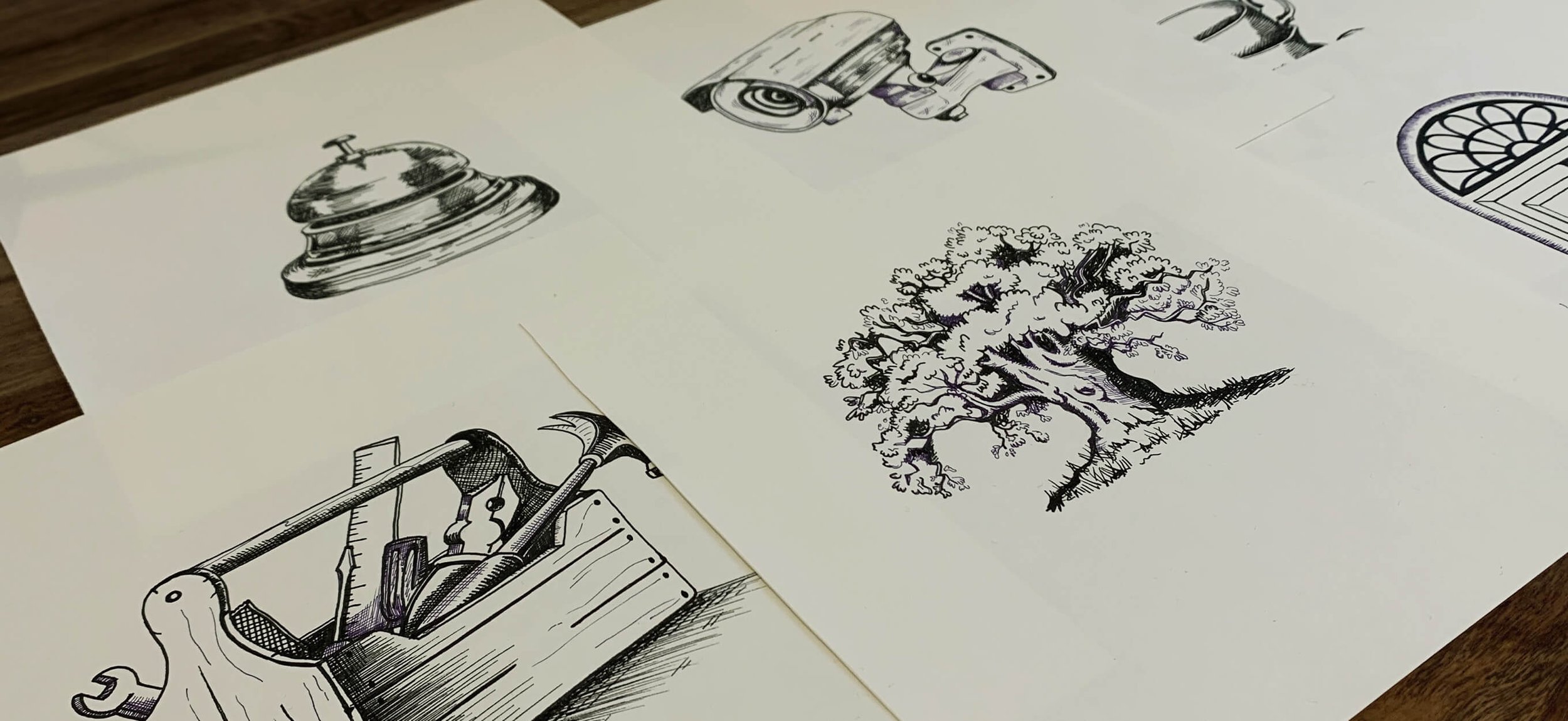
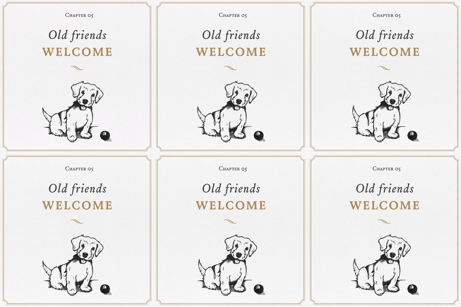
We created hand-drawn, bespoke illustrations using an etching style to reference the beginnings of chapters in old books. Coupled with the layout of the design, and titling each piece with a chapter number, our concept came to life as individual pages of a book on why moving to the development would be the right choice.


