Y.CO

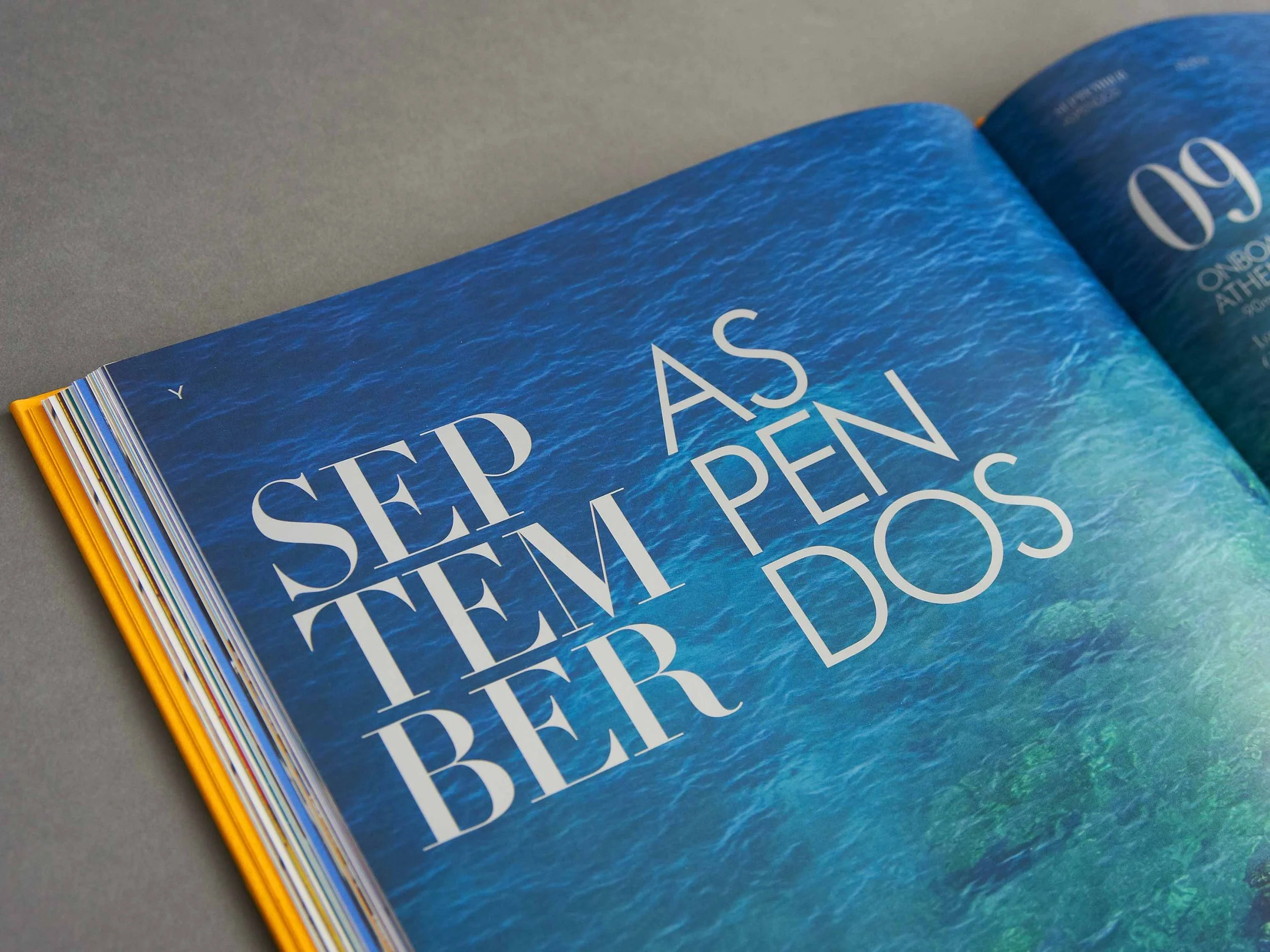
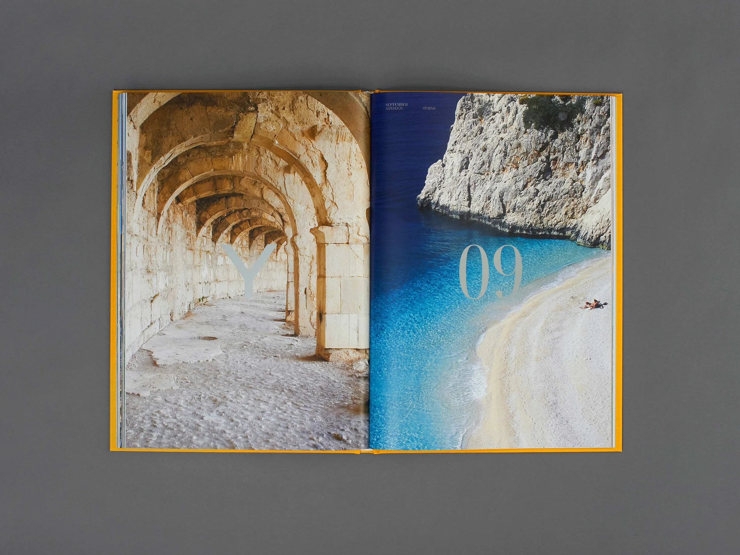
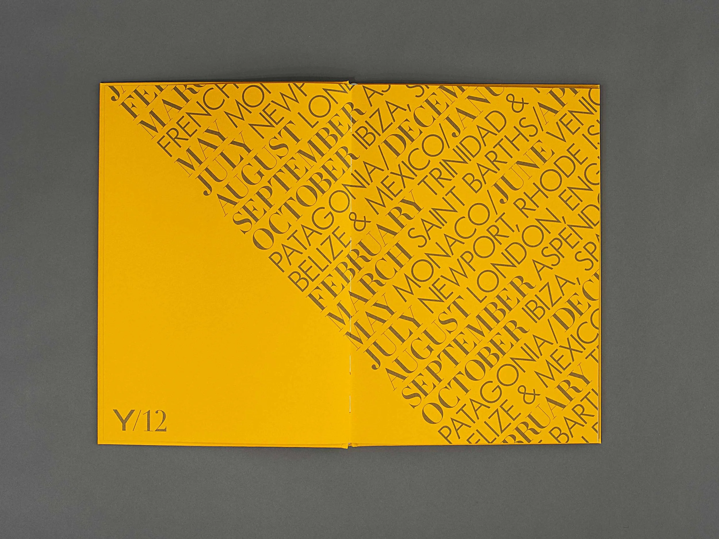
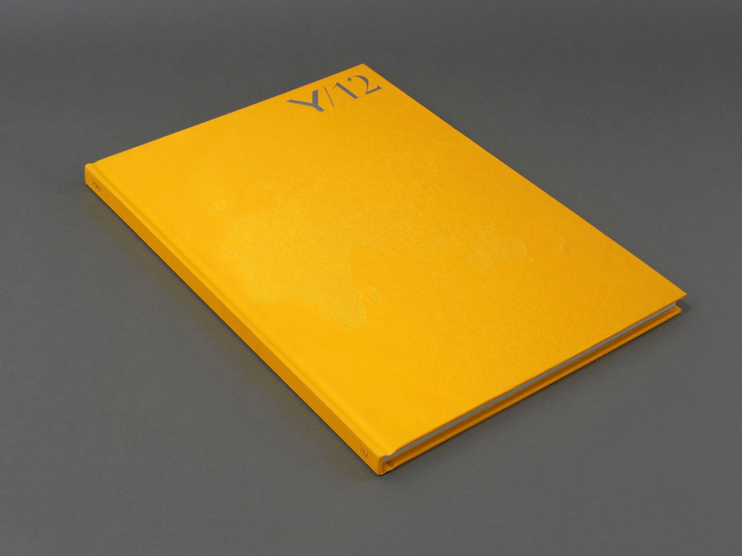
For the last 20 years, Y.CO has been a cornerstone of the yachting community. Younger, faster and louder, they disrupted the industry with their strong personality and even stronger offering. Never one to follow suit, they wanted to create something different to the brochures their competitors were putting out. We designed an inspirational coffee table book that aligned a yacht and destination for each month of the year 2012. The photography and copy skewed luxury whilst remaining fresh. We printed on Colorplan and created a map design for the cover that was made of many tiny Ys that were debossed and foiled.

Our output included…
Editorial design
Print

A year in yachts

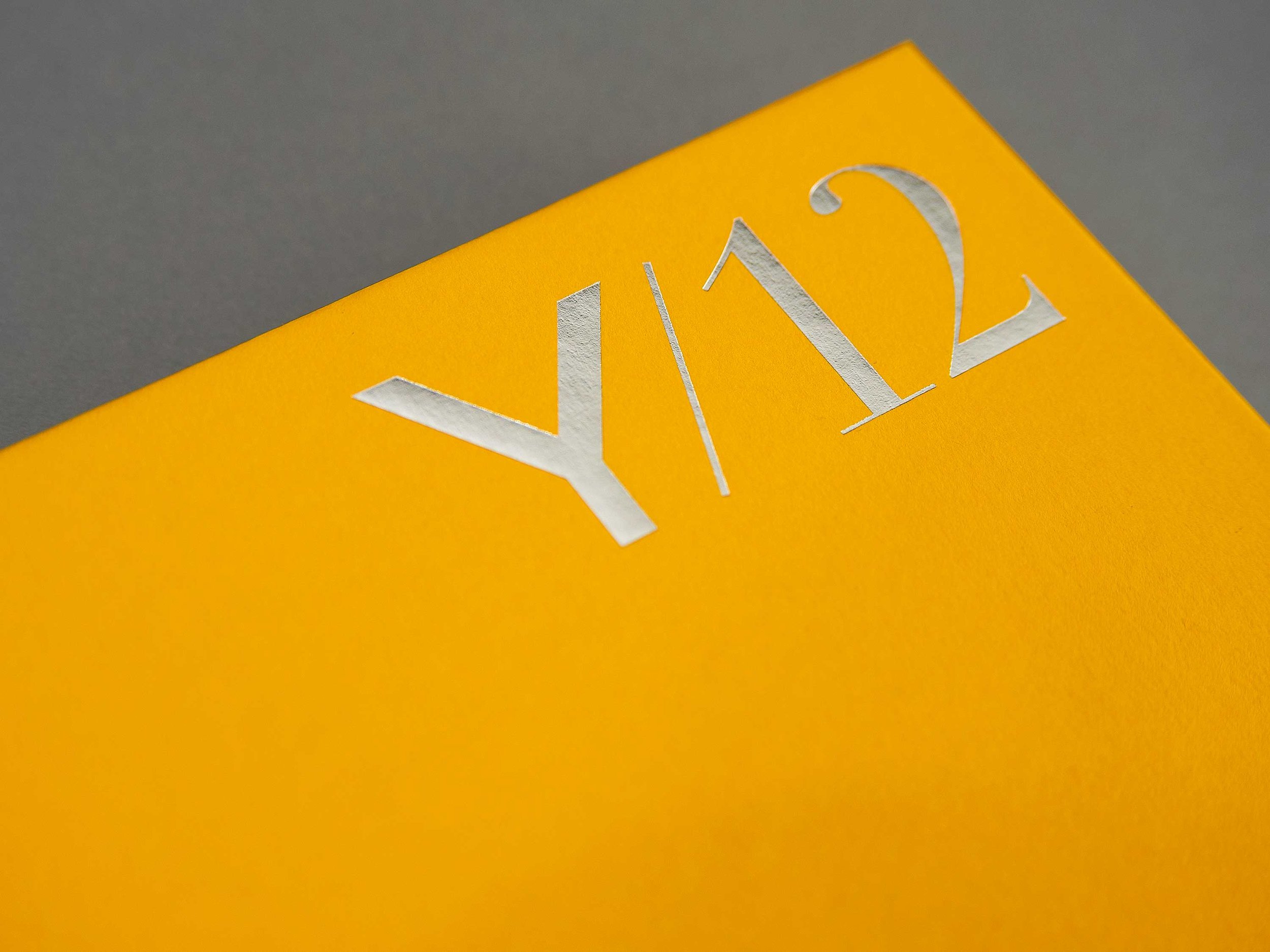
Corner of Y.CO branded year in yachts book in colour yellow with silver logotype
Double page spread in book with text reading September and Aspendos over an image of the sea
Image of a man swimming in the sea with his arms wide
Double page chapter separator in book, image of ancient archways and a secluded beach with one person on it. Text over reading Y 09
Close up of printed front cover details, die cut in yellow and white
Close up of printed front cover die cut details showing the outline of a map
Inside cover pattern showing months of the year and names of yachts in yellow and grey
Close up of inside cover showing months of the year and yacht names in yellow and grey
Double page spread with imagery of featured yacht and text on location
Printed book front cover in yellow with grey logotype and die cut details

See more of our work

Aureum

James Eadie

Sea&I

Previous
Previous

Yolo

Next
Next

The Run To in Paris