THE RUN TO IN PARIS
Capturing a unique experience
with a handcrafted invitation
The Run To is a five-day supercar rally that takes place every summer.
Continuing our ongoing relationship with the luxury motoring event, we were asked to create a set of personalised invitations for the 2019 drive from Paris to Monaco, ending in time for the Monte Carlo Grand Prix. The theme for 2019 takes its inspiration from 1920s Paris and the film Midnight in Paris.
Our output included…
Copywriting
Editorial design
Visual identity
Print

The invitations, which were sent out to 200 select guests, needed to feel special and pique interest. We wanted to
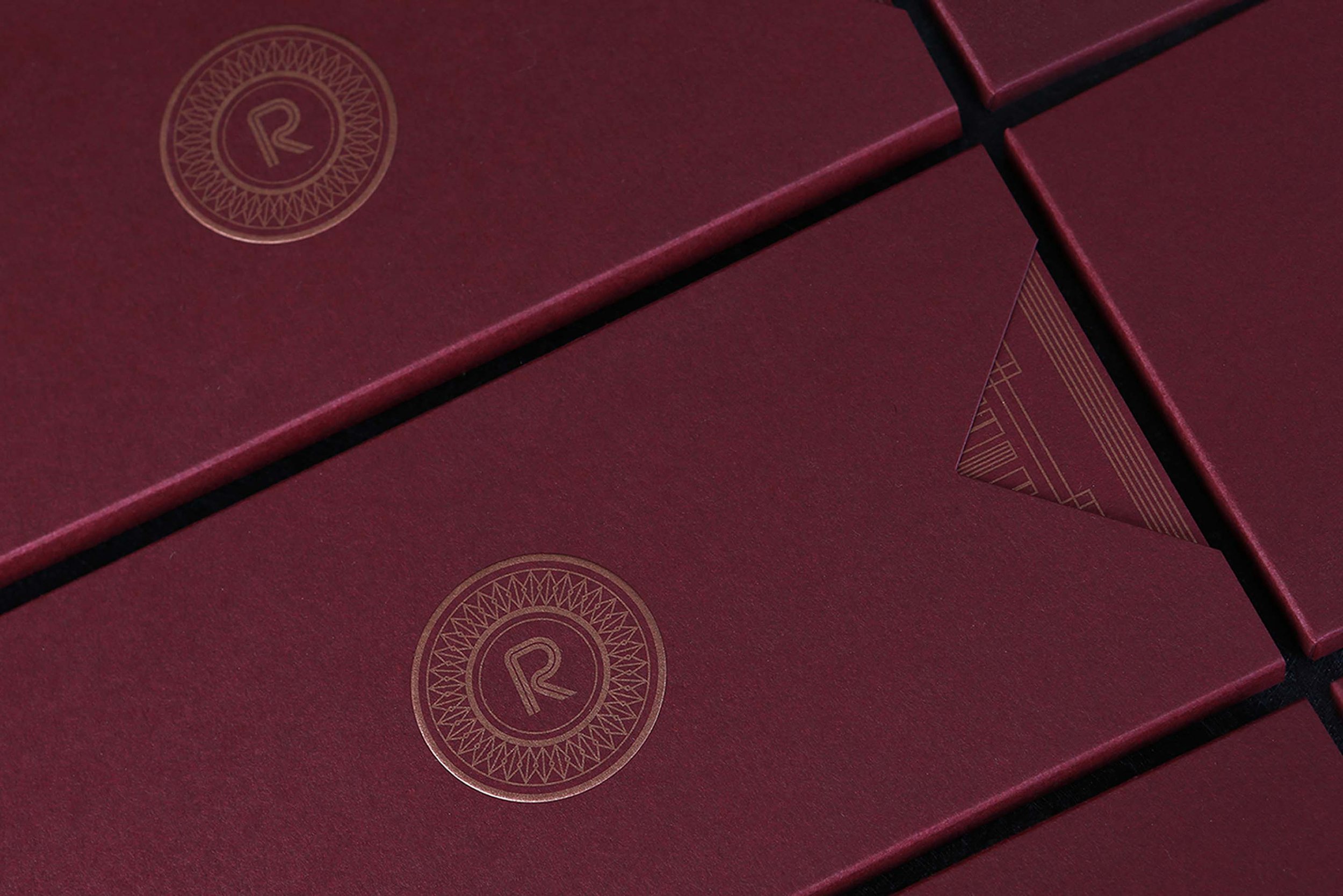
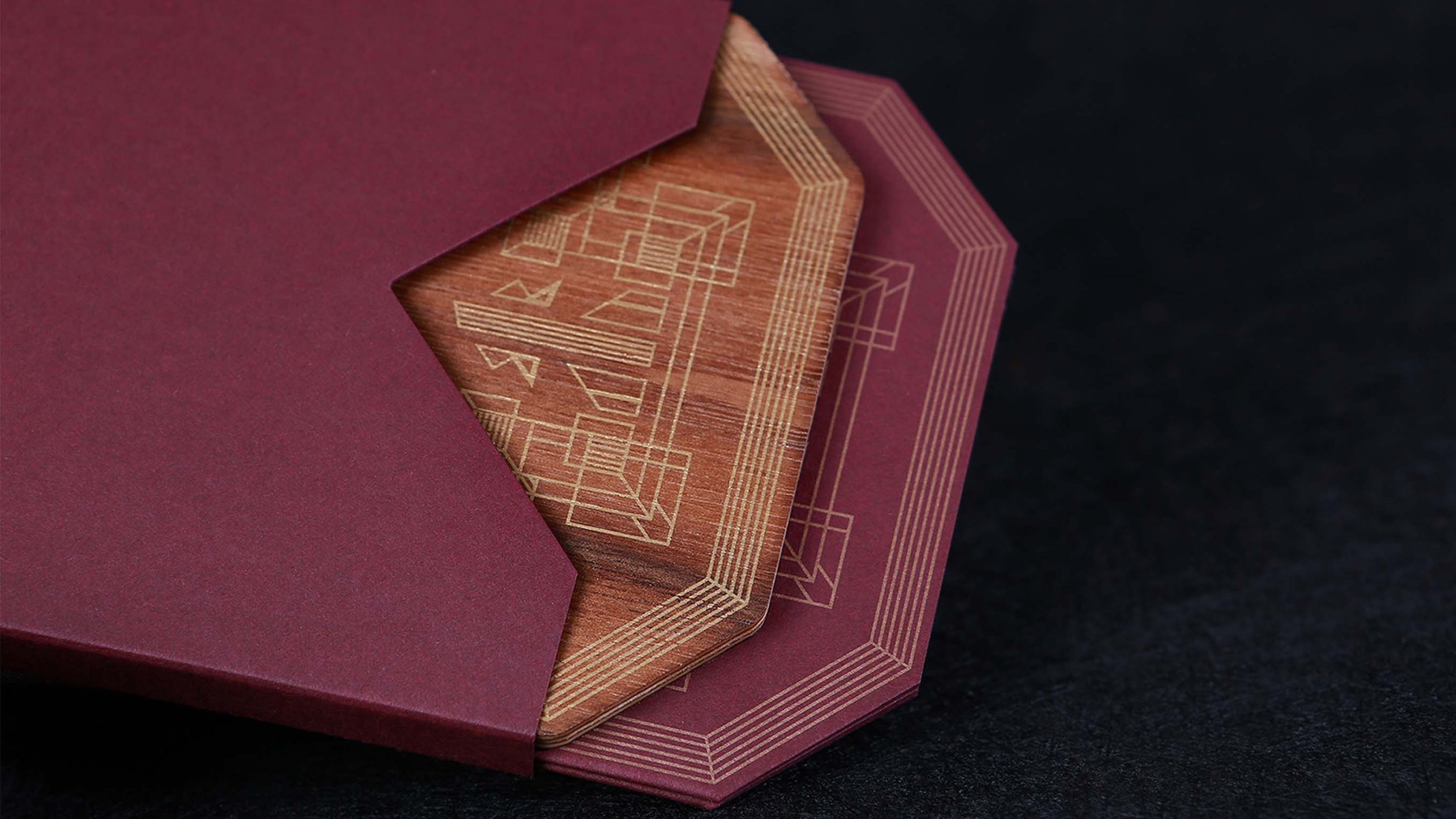
create something tactile that felt more luxurious than paper. Inspired by Art Deco design, we produced a geometric wooden invitation finished with an American walnut veneer. We also produced an accompanying brochure with a concertina fold. Both of these were enclosed within an embossed slipcase. All text was screen-printed in gold, including the main display type.
The starting point for The Run To’s drives are as important as the final destination and they set the tone for the whole journey each year. The premise of Woody Midnight in Allen’s Paris is a modern man immersed in old-world Paris, which is the same way we approached the invitation – a modern take on Art Deco. The wood references mahogany furniture from the period and we worked closely with wood specialists for the project to produce something handcrafted.
The concertina-fold brochure features original illustrations
of landmarks from the four main stops on the route: Paris, Burgundy, the Alps and Monaco. We designed a bespoke geometric pattern to be used throughout collateral and a crest to frame the logo. To add variety and layers, we worked with three fonts (Hill House, KH-Metropolis and Serenity). Finally, each invitation was cut and finished by hand before being treated with linseed oil to bring out the natural grain of the wood.
We set out to create an invitation that captures something about the experience of The Run To Monaco 2019, which will recreate elements of Midnight in Paris. Our design route established the style of the signage and printed collateral we produced for the event.


